
Cambridge Cryogenics explores the landscapes of tuning materials. They also discovered a new class of quantum transition that opens the way for a whole new subfield of materials physics and quantum technologies.
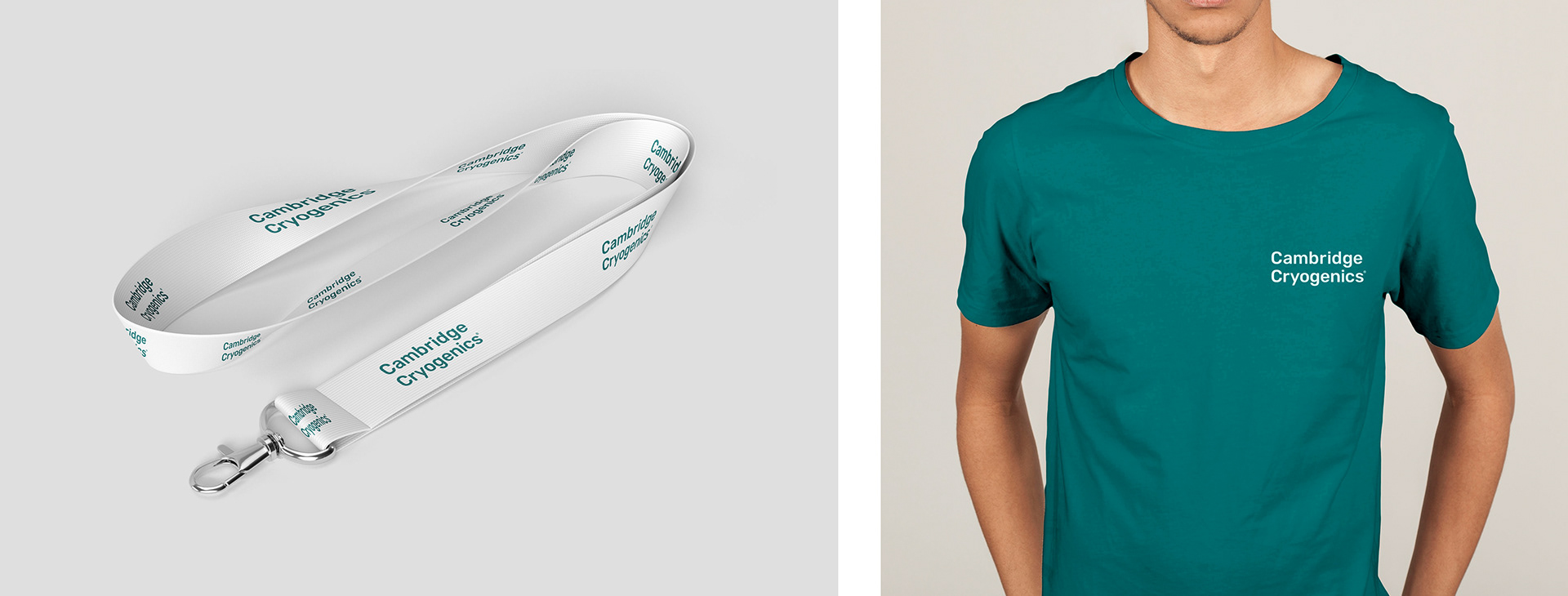
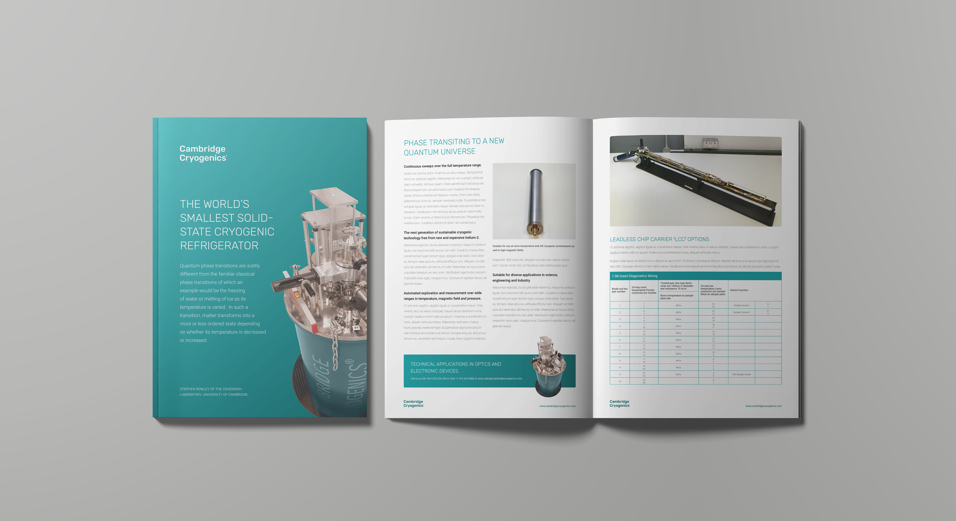
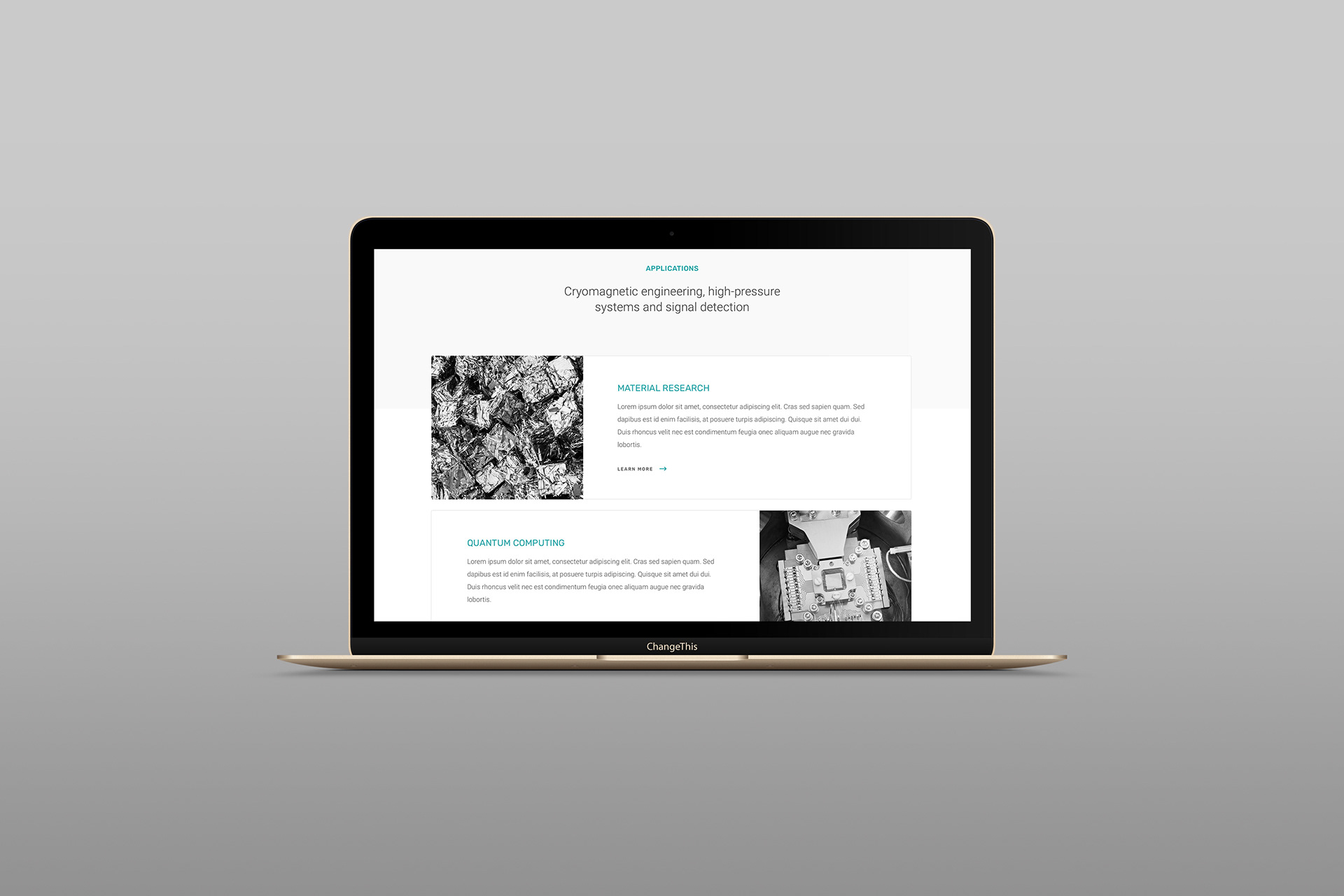
My role in this project as a designer was to create a logo and branding identity along with some samples of long print documents. The choice of the main colour was based on the fact that turquoise has cool and calming attributes. The colour is associated with meanings of sophisticated, energy, wholeness, and loyalty. Darker shades of turquoise are used to represent water. The combination of two google fonts in their thin weights gives the design the feel of cutting edge technology.